


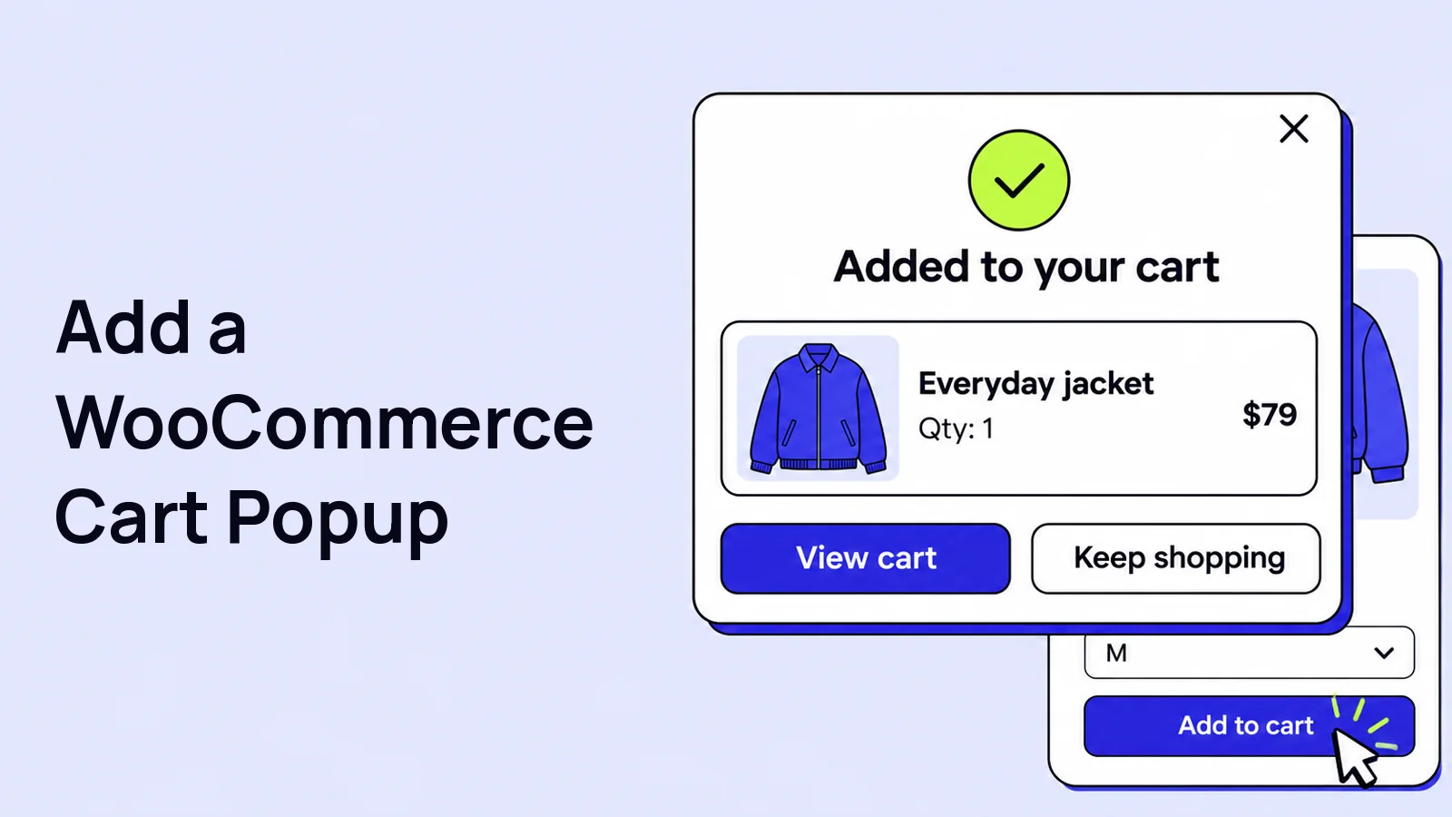
A WooCommerce add to cart popup confirms what a shopper added and offers a clear next action. Configure where it appears in Swift Commerce, review the design and test its cart and checkout buttons.
This guide uses Swift Commerce Add to Cart Popup. We will enable the popup, choose where it appears, review its design and test the real purchase actions. The basic popup is available in Free. Pro adds controls such as custom action buttons, product recommendations and additional design options.
Before enabling a WooCommerce add to cart popup
Install and activate WooCommerce and Swift Commerce. Have a published, purchasable simple product with a price and available stock. You will also need working Cart and Checkout pages.
Start on staging if your theme or another plugin already opens a cart drawer or confirmation popup. Decide which interface should appear after adding a product. Two competing overlays are not a useful confirmation.
1. Enable Add to Cart Popup
- Open Swift Commerce → Add to Cart Popup.
- Turn on the feature using the switch in the header.
- Click Save Changes.
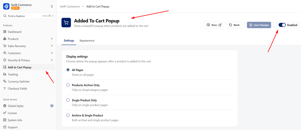
This is a response to a successful add-to-cart action. It is not an exit-intent popup or a message that should open as soon as someone visits a page.
2. Choose where the popup should appear
In the Settings tab, review Display settings. The choices are All Pages, Products Archive Only, Single Product Only, and Archive & Single Product.
- Choose Archive & Single Product if you want to begin with normal shop/category and product pages.
- Choose Single Product Only if you only want it after a purchase action on a product page.
- Click Save Changes.
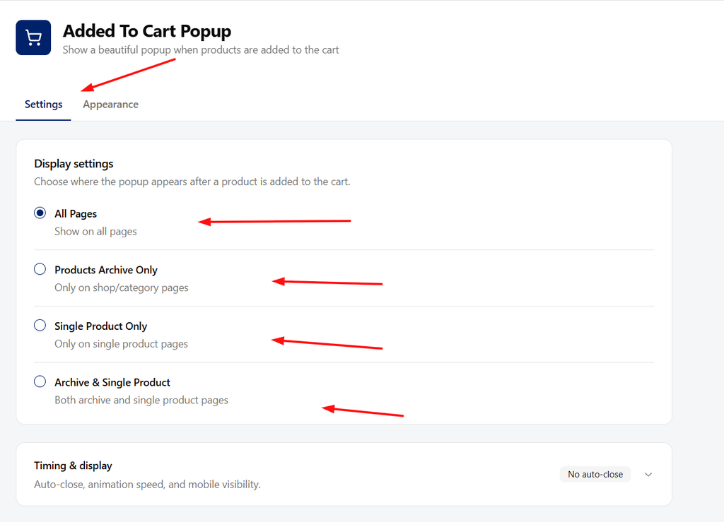
“All Pages” means the popup is allowed after supported add-to-cart actions across the site. It does not mean it opens on every page load. If your product cards appear on a custom landing page, include that exact placement in testing.
3. Set the timing
- Expand Timing & display.
- For the first test, leave Auto-Close Popup off.
- Review Animation Duration.
- Save your changes.
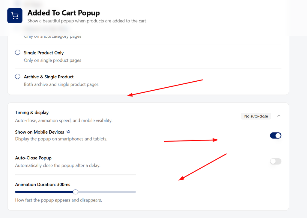
Leaving auto-close off initially gives you time to check the product, prices and buttons. If you enable it later, allow enough time for a customer to read and act. A popup that disappears before someone reaches Checkout is more frustrating than helpful.
With Pro, the same section also includes Show on Mobile Devices. If you use that control, make sure the setting matches your intended mobile experience. Check the real phone layout rather than assuming a desktop preview covers it.
4. Choose a design and review the preview
- Open Appearance.
- Choose a design preset such as Classic.
- Review the live sample preview.
- Use the available design controls to match the popup to your store.
- Click Save Changes.
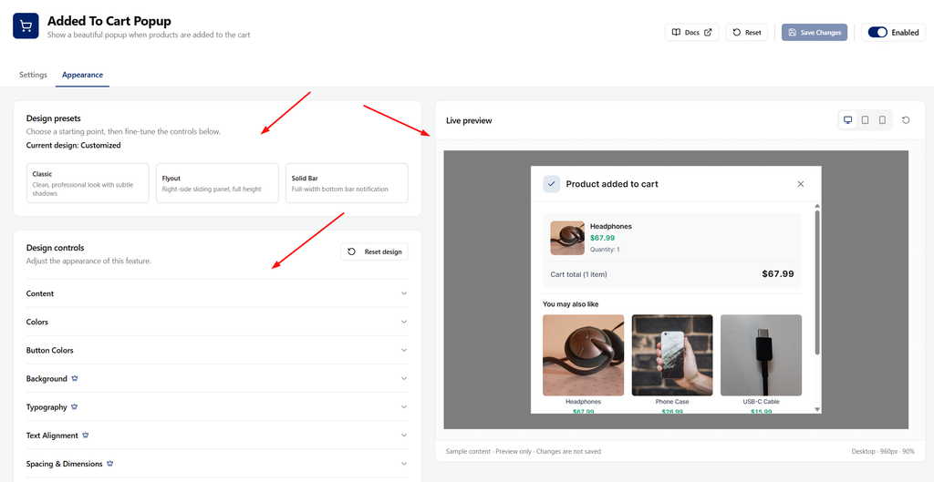
Start with readable text, enough contrast and buttons that fit their labels. You do not need to change every control. Some advanced appearance options require Pro, so follow the controls available in your edition.
The sample preview does not add anything to a customer’s cart. It also cannot prove that a particular product type, theme or custom buying button will trigger the popup. That comes in the storefront test.
5. Review the customer’s next actions
The popup can offer routes to view the cart, proceed to checkout or continue shopping. Make sure the actual displayed actions make sense for your store.
With Pro, expand Popup buttons in Settings. Choose which actions to show and set their labels:
- View Cart Button: opens the cart so customers can review or change their purchase.
- Checkout Button: takes them to checkout.
- Continue Shopping Button: closes the popup and returns them to browsing.
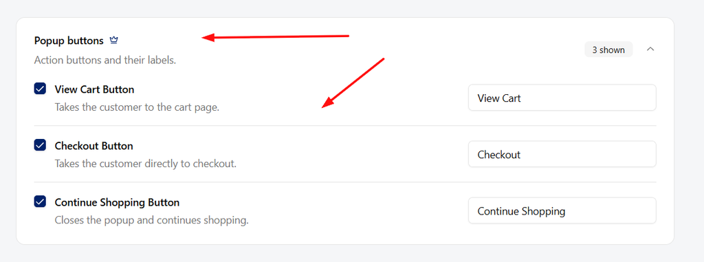
Keep labels literal. “Checkout” is easier to understand than a clever phrase that hides the destination. The basic Free popup does not require you to configure the Pro button controls.
Pro also has Product recommendations, including Show Related Products and Show Recommended Products. Leave them off for the first test. Once confirmation works, enable relevant recommendations and check that they do not bury the item the customer just added.
6. Test a successful add to cart
- Open the storefront in a private browser window.
- On the shop page, add your in-stock simple product.
- Confirm the popup opens after the product is added.
- Check the product name, image, quantity and price.
- Close it and open the cart. Confirm the item was added once, not twice.
- Repeat from the single-product page.
- Test the View Cart, Checkout and Continue Shopping actions that are shown.
If nothing appears, confirm the feature is enabled, the display setting includes that page and the product can actually be purchased. A product that requires a variation or another choice may need its product-page selection completed before it can be added.
Also check for redirects or another cart interface taking over the action. Inspect the site’s actual add-to-cart behavior before changing random popup design settings. A third-party custom button may not behave like WooCommerce’s standard button.
7. Test variations, errors and mobile
After the simple-product test, check the product types and flows your store uses:
- For a variable product, select a valid variation and confirm the popup identifies the selection.
- Try to add a product without a required choice. The customer should see validation, not a false success message.
- Check stock or quantity-limit failures.
- Try the popup on a small screen, including its close control and longest button label.
- Use the keyboard to check that the actions remain reachable.
- Confirm the original cart quantity and checkout totals remain correct after closing and reopening the popup.
If you also need minimum or maximum quantities, configure those on the product using our quantity limits guide. The popup confirms cart actions; it does not replace product validation.
Frequently asked questions
Will this replace my checkout?
No. It confirms an add-to-cart action and can link to the existing cart or checkout. Those WooCommerce pages still handle the purchase.
Does the preview prove the popup works on my store?
No. The preview is a design aid. Test a real storefront add-to-cart action and inspect the resulting cart before enabling it for customers.
The Add to Cart Popup documentation covers the remaining settings.
Check the Swift Commerce listing on WordPress.org for Free installation requirements and downloads.